
The beginning of the process for developing a new Primizie logo. I started with simple sketches that played around with typography and icons.

One of the possible designs for the Primizie Crispbreads packaging. Going for a natural aesthetic and simple imagery.

The final sketch for the packaging design. Typography and imagery interact in an interesting way, creating a focal point. The shapes in the background mimic the shape of the chips.
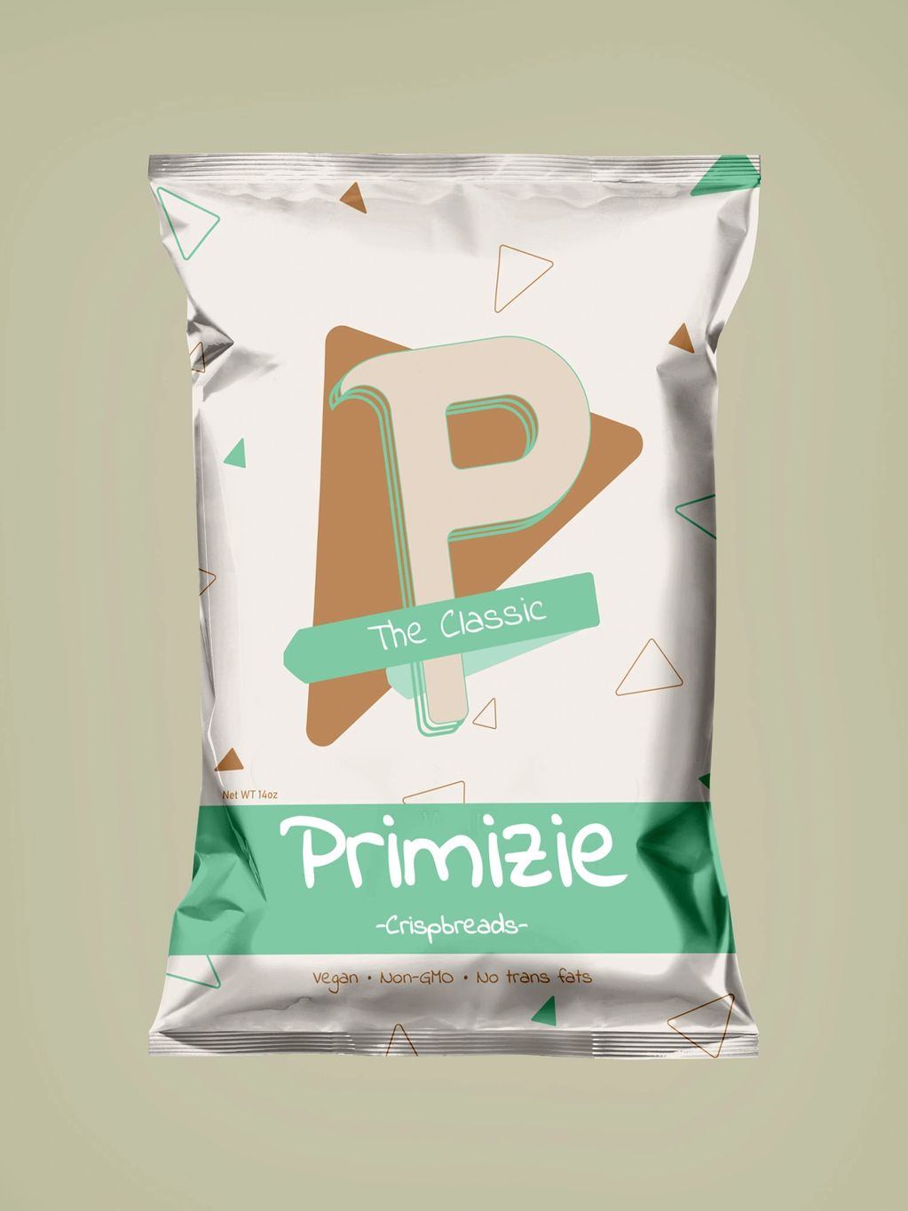
The final design with a natural color scheme and simple geometric shapes.